BRANDING - the Evolution of Annie
Client: Annie Sipaseuth
Occupation: Stylist/Colorist
LOCATION
James Colgan Union Square
166 Geary St, 1600
San Francisco, CA
(510) 375-2392
annie@jamescolgansf.com
Instagram @hairby.annie
The Beginning
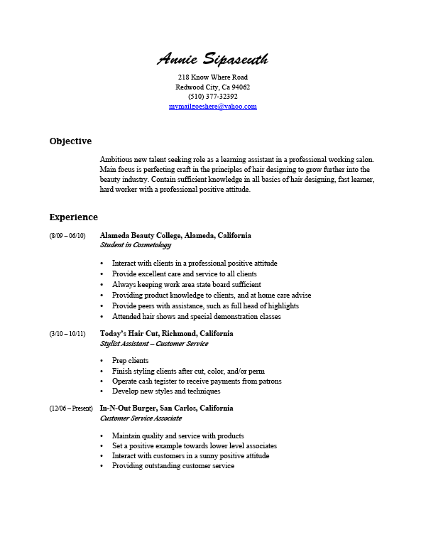
When I first met Annie she was working at a quick service restaurant and going to a local beauty school to be a hair stylist. Her first apprentice gig didn't last long as they were not a fit for each other. Moving on from there she decided that she needed to spruce up her resume so she reached out to me.
This is her original resume done in Word.
First Evolution
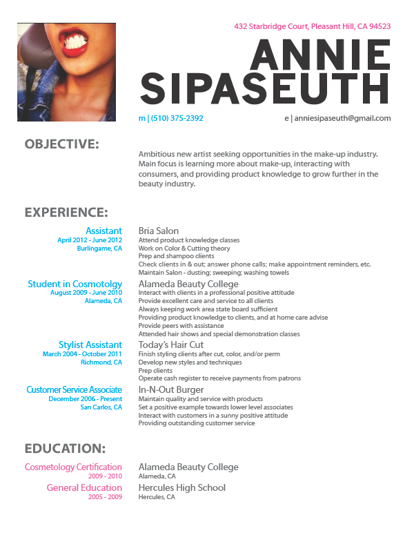
From the meeting I gather that she was pursuing a career in Hair but also had a passion for Make Up. Something simple but yet would make her stand out with a little bit of character. Since I wasn't formally trained in Graphic Design I started doing research online and did some field studies. Going to beauty stores so I could study their branding hoping to get a better understanding of that industry.
My first proposal is what you see here. To be honest it was really conservative and my side hobby (B&W Film Photography) was influencing my design. During that time I believe in "No color," as color was distracting from the more important content. And, of course, she didn't like. Who could blame her? She did like the layout but it needed more.
Second Evolution
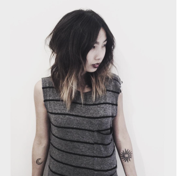
With a layout in hand, I just had to figure out how to give it some character. Since we were already friends I browsed through her Instagram account to get a better feel of her style. Young, fun, bold, and yet well put together. Which was enough fuel to get the brain spinning.
Borrowing one of her Instagram photos I presented her this revision to her.
It had a bit more attitude than she was expecting but she also thought it was going to be great at grabbing people's attention. It was. Within a week she had a job offer for her first Assisting Job in San Francisco.
THE GOOD
Bold; Attention Getter; 7 out of 9 salons that she dropped of her resume at called her for an interview.
The Bad
Too much attitude; Mispercive perception (they were already expecting a certain type of person to show up at the interview); She honestly did not like the picture on her resume
But it did the job and it did it well as she was offered a position in a salon.
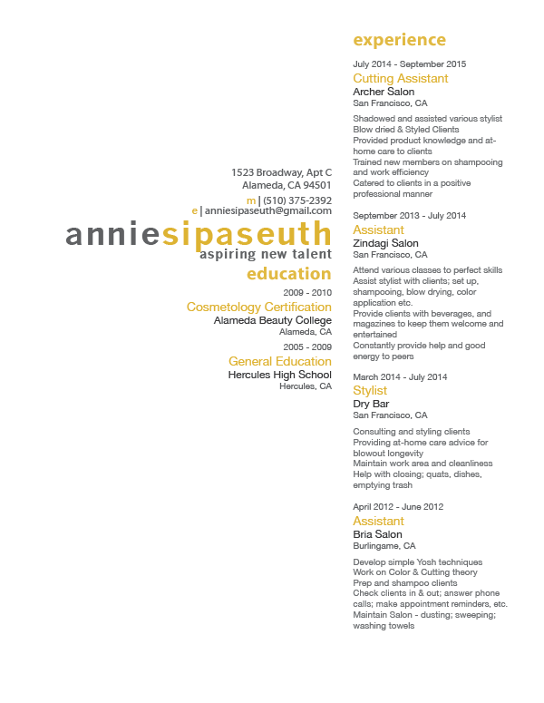
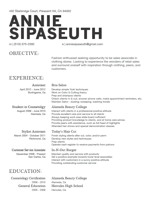
Third Evolution
After being at her first Assisting role for over a year, Annie thought it was time to move on to a higher end salon. So she contacted me for a new resume. Learning off the Pros & Cons from the previous resume, we knew she wanted something fresh!
Knowing where she wanted to be at helped me create a new layout for her updated resume. Asides form it being fresh, she also wanted something clean and airy like summer time breeze. This was the result.
As simple and clean looking as it may look. There was a lot I had to understand to make this modern resume work. From creating a new grid layout, to understanding the relationship of White Space, all these challenges made me better as a designer as I now had justification and cause to why I did something.

Evolution NOW
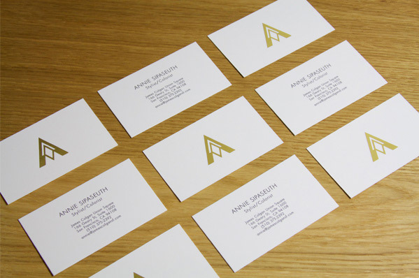
With a successful resume, she was able to pursue her career in the Hair Industry. Fast forward to 2016, she is now Full Time on the floor. Which means a new stage in her life and another job for me but this time she wants to create a Brand Identity for herself. She needed a logo that represents her sense in style and how she wanted to be perceived.
The "A" is based on the first initial on her first name
The diamond is to represent that she works in the High End Industry
The two tone is to represent that she is a Stylist and a Colorist
Printed in Gold Foil, on 19pt, 90lb paper for her business cards
60lb for her letter head
Text and borders done in Monochrome
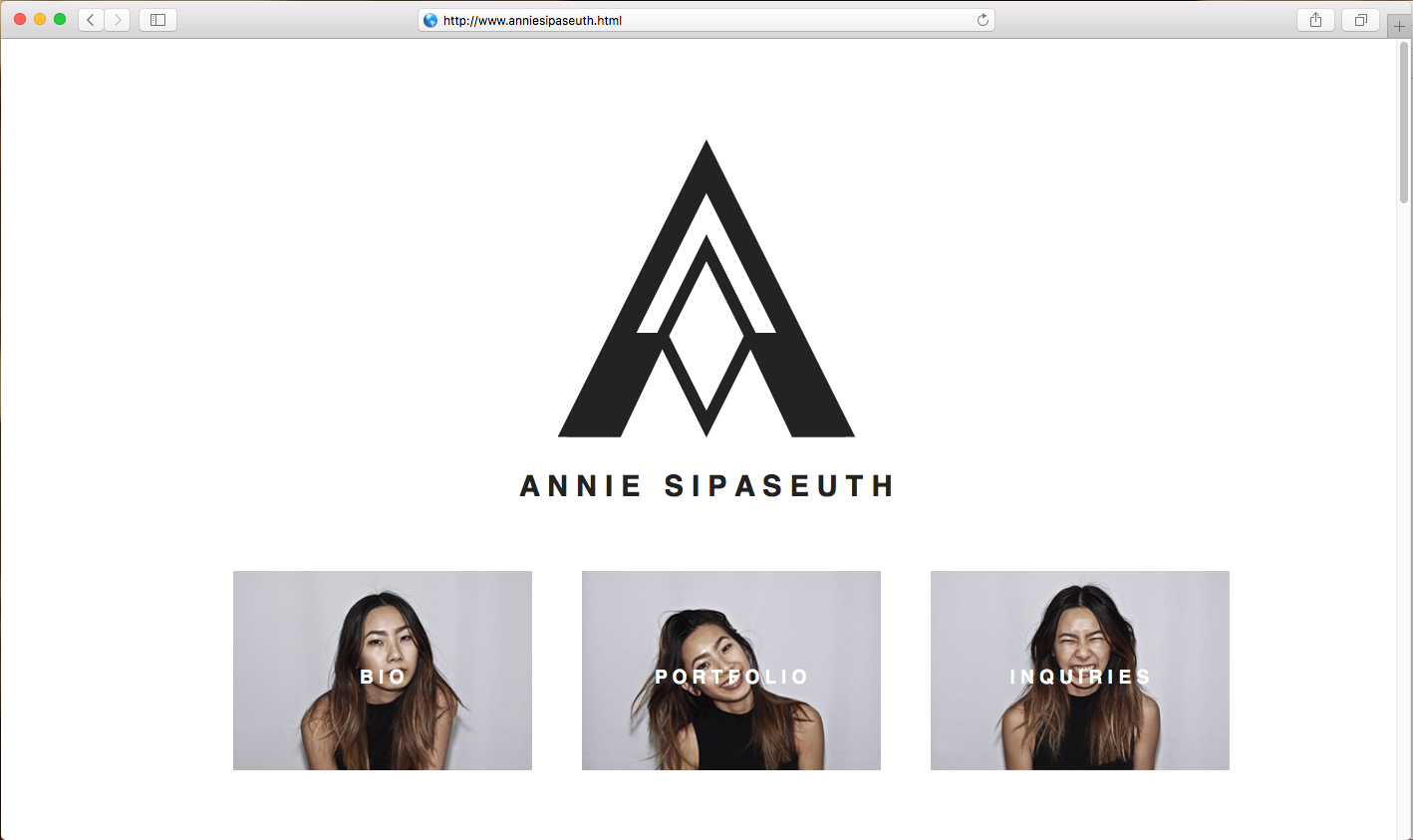
For the website, she wanted a clean and minimal website. Designed to showcase her work.
The website never went live as she believe her Instagram was more than enough. It is archived in the link below
http://st-micma.com/portfolio/anniesipaseuth.html